

The signup form or newsletter signup email is a powerful tool for growing your email list and cultivating loyal visitors. This approach allows visitors to willingly share their email, expressing a desire to stay connected. However, considering the user’s perspective, it’s crucial to recognize that after learning about your offerings, a visitor might move on to other things.
Even if a user has the intention to connect with your brand in the future, without a simple and inviting process, many users won’t take the initiative. Here’s where a smart business strategy comes into play. By strategically placing a popup or a well-designed email newsletter signup form on your website, you create an opportunity to capture the user’s interest.
In the following discussion, We’ll explore live examples from well-known brands, examining how they craft their email newsletter signup forms. Additionally, we’ll provide practical tips and design examples, offering a comprehensive guide for creating your own form. Whether you have an eCommerce site, service-oriented website, or any other platform, you’ll gain valuable insights on designing an effective signup form.
Warby Parker
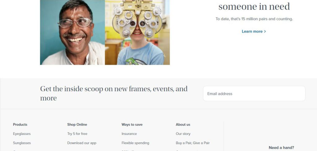
Warby Parker, a popular eyewear brand, offers a budget-friendly Home Try-On program. The simple and attractive signup form keeps users informed about new frames and events. They assure users that signing up is about staying updated, not just collecting your email or data.
Book Outlet
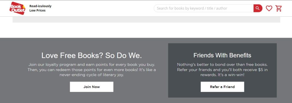
Consider offering gifts, such as those from Book Outlet. The signup form features a clear ‘Join Now’ button, allowing users to earn points for future book purchases, or you can say, to receive a free ebook. This distinct approach helps your brand stand out to users.
Cat.com
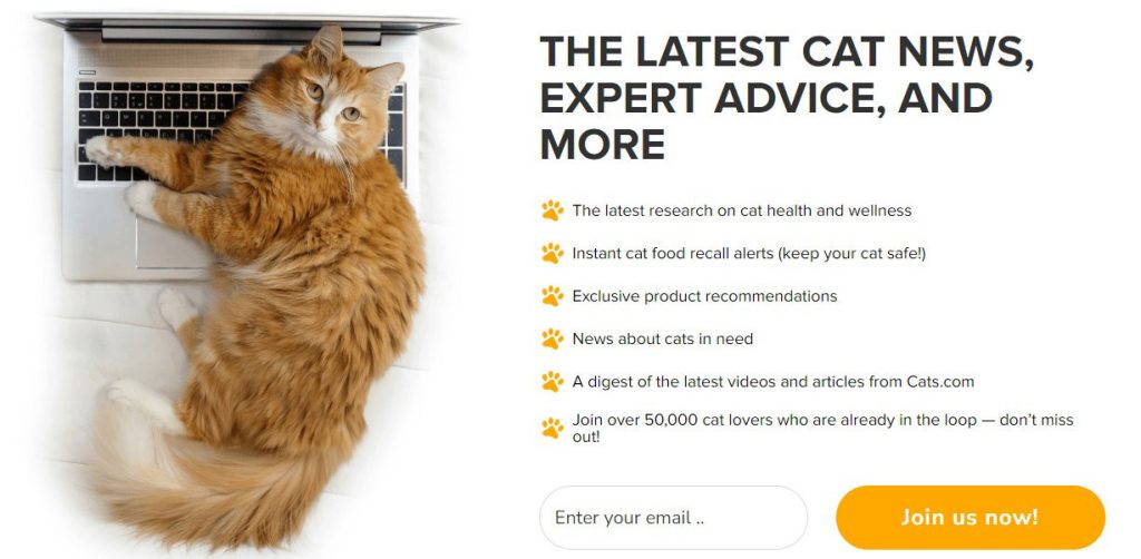
Another effective signup form from cat.com stands out. They clearly outline the benefits in bullet points, assuring users that joining will bring valuable content such as cat news, advice, and health and wellness.
What sets cat.com apart is their use of a specific number, 50,000, implying a guarantee of successful signups. Using numbers and social proof can greatly attract and keep regular customers.
FabFitFun
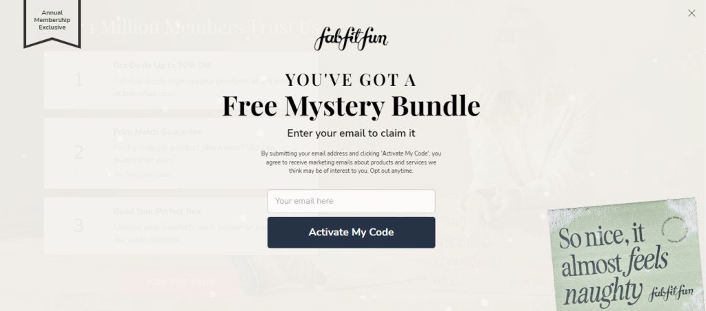
FabFitFun’s signup form strategy caught our attention. They use a popup with three mystery boxes to choose from, where users can claim an attractive code via email. Additionally, there’s an element of curiosity and flexibility in this offer – you can explore what’s inside by checking with your email. If you wish, you can unsubscribe after checking it out once, although it’s rare for anyone to do so. The likelihood is high that they offer something amazing, making it a great way to grow your audience list.
When you scroll down, there’s another signup form from Fabfitfun, showcasing 1 million trusted members and offering great deals. The button says “join the club,” which is different from the typical “submit” or “sign up” buttons, making it stand out.
WebMD
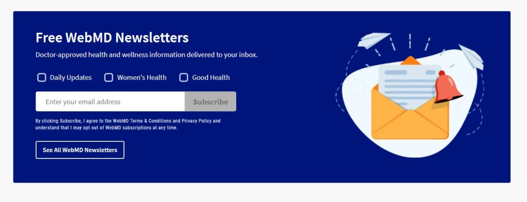
If your topic is wide-ranging, let users pick the type of emails they want by adding category options to your signup form, inspired by WebMD. For instance, a Pet Care and Health site can offer categories like Nutrition, Routine Care, and Behavioral Wellness, allowing users to receive tailored content based on their interests.
It’s a good idea because if you send too many emails very often, people might get bored and not open them unless it’s something they’re really into. That can make your email stats, like open and click rates, go down.
Mashable, Away, and Macy
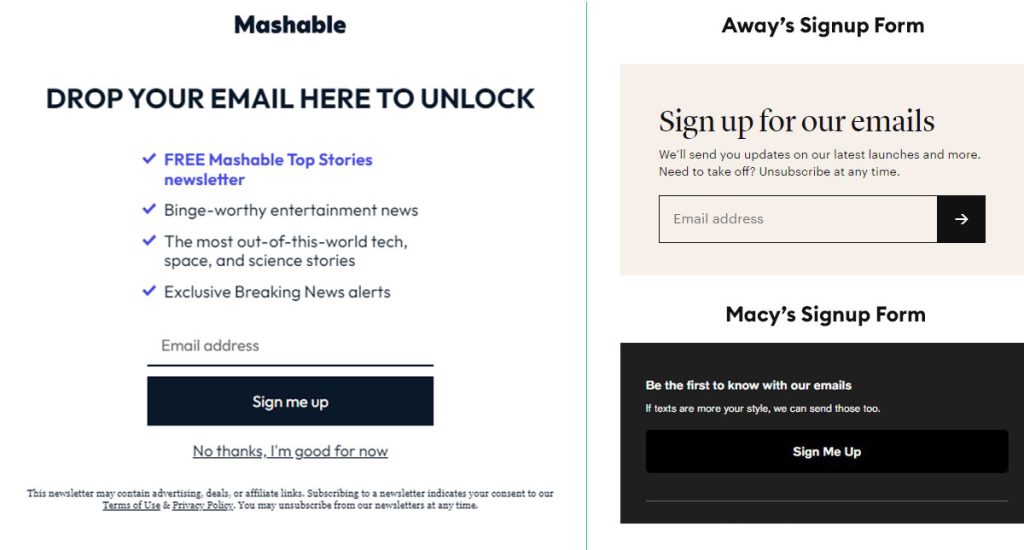
Mashable, Away, and Macy’s—look at their signup forms. Simple design, powerful text. It feels like they put you first, updating you on their latest stories, events, and styles. As a user, I prefer getting the newest content in my inbox rather than visiting the website every time. That’s why we recommend a clean, minimal design and straightforward information in your emails. Make it easy for users to fill out the form.
Add countdown timer
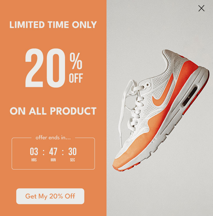
A highly effective yet often overlooked technique is using countdown timers on sign-up forms, especially in pop-up formats. This method consistently yields the best results in generating leads for our projects
Boost engagement by adding a countdown to a special offer. This psychological tactic encourages users to opt in via email, with the timer being the key element that catches their attention. It’s important to make the form visually appealing, with captivating text, images, and an overall attractive design. The more engaging the form, the higher the likelihood of converting a visitor into a loyal customer.
Let’s talk about Email newsletters/templates
If users don’t see a prompt response after filling out your sign-up form and joining your email list, it’s a significant barrier to converting them into customers. They might forget about the brand or website they signed up for, and on the flip side, if they receive too many emails without value, they’re likely to unsubscribe. To address this, strategic actions are essential.
We can make things easy by using automation. When someone signs up, we’ll send a welcome email. Then, a few days later, we’ll share more about the brand and later provide useful tips, highlighting relevant services or products. This automatic process helps engage users with the brand. To make it even simpler, we can pick a user-friendly email platform like Mailchimp, ActiveCampaign, MailerLite, Marketo Engage, or any other that suits your brand.
Marketo provides powerful automation features, like lead scoring, dynamic segmentation, and personalized email journeys. They also offer a range of core templates for various email needs, such as newsletters, announcements, product updates, event invitations, welcome emails, and thank-you emails. If you’re looking for advanced automation features, consider exploring Marketo email templates to simplify your email marketing.
If you are a complete beginner, you can explore MailChimp. Mailchimp offers a variety of pre-built email newsletters within their Mailchimp email newsletter service. You can effortlessly customize these using their drag-and-drop editor or create newsletters from scratch. Moreover, you can build connections with your users through automation, segments, groups, tags, and more.
HubSpot provides an excellent Email Marketing Planning Template. You can access and download it from their website through by clicking here. You can use it in Microsoft Excel or Google Sheets based on your preference.
FAQ
What’s the size or dimension of the email newsletter signup email?
For the best display on both desktops and mobile devices, it’s recommended to keep the form width between 600-650px. The height can vary based on the number of fields needed. Try to keep the form concise to prevent scrolling – users may hesitate to submit if they see too many fields. So, it’s a good idea to include only essential fields.
What are the ideal dimensions for email newsletter design?
Typically, email marketing platforms adhere to a newsletter/template width of 600 pixels, accompanied by an image size ranging between 800-1200 pixels. We have a blog that shows how to create an HTML newsletter without coding. Click here to read!
Where can I get ideas for creating newsletters and sign up forms?
You can find ideas for creating newsletters and sign-up forms on platforms like Dribbble, Pinterest, Behance, and Envato. Additionally, a Google search for ‘real estate email marketing templates’ will provide plenty of inspiration in the image section.
We hope you enjoy our blog! Explore our homepage for more articles similar to this one.

")